The Ophthalmologist | Conexiant
Product Story: The Ophthalmologist Website Revamp
Role: Product Designer Manager
Industry: Medical Publishing / Healthcare Professionals
Platform: Web (Desktop + Mobile)
Client: The Ophthalmologist (a publication by Texere Publishing)
The Challenge
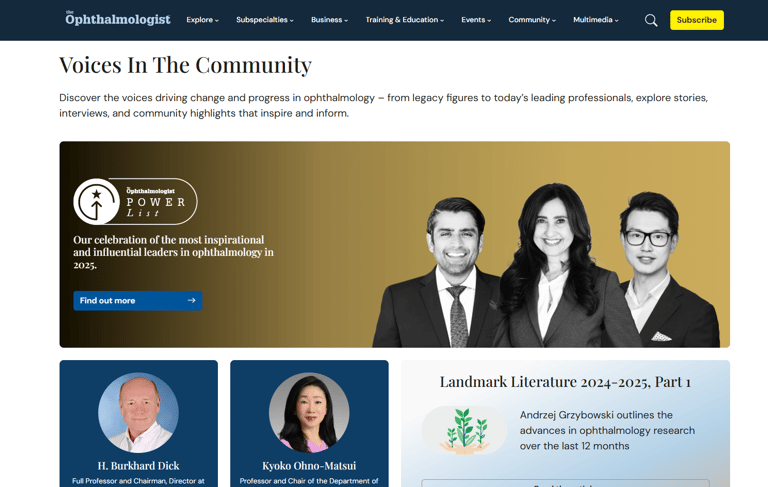
TheOphthalmologist.com, a leading editorial platform for eye care professionals, faced declining engagement due to a fragmented user experience, outdated taxonomy, and poor mobile responsiveness. The platform struggled to meet the evolving needs of its audience—surgeons, educators, and medical residents—looking for high-value content, expert insights, and learning resources.
Discovery & Research
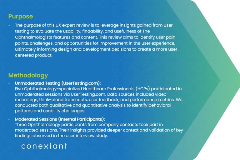
To define a user-centered redesign, I led an in-depth discovery phase, which included:
UX Audit (Qual + Quant):
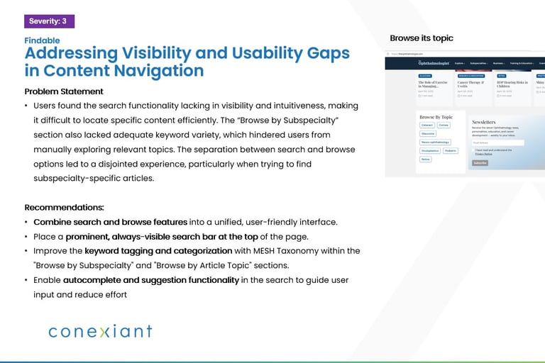
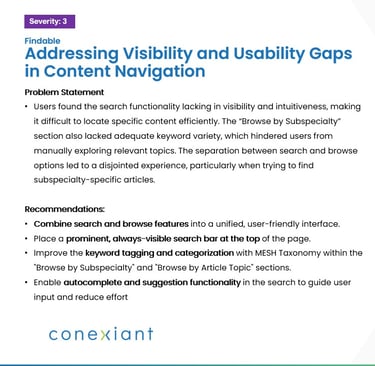
Heuristic analysis, Google Analytics review, and heatmap insights identified key drop-off points and usability pain areas.User Research & Interviews:
Conducted 15 moderated interviews and 40+ survey responses to uncover user goals and pain points.Persona Development:
Crafted three key personas: Dr. Insightful (surgeon), Resident Riya (learner), and Educator Elena (contributor).Taxonomy & Content Audit:
Collaborated with editorial and SEO teams to define a scalable content structure and improved filtering logic.
Testing & Validation
I created a usability testing plan with both moderated and unmoderated sessions:
Tested the existing site's navigability, content access, and subscription flow
Prototyped new navigation, homepage layout, and article pages in Figma
Synthesized learnings to refine the user experience across journeys
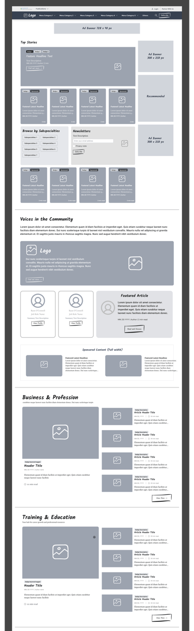
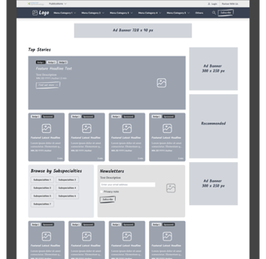
Key Solutions Delivered
Reimagined homepage layout with dynamic content blocks and personalized modules
Introduced a smart filtering system by subspecialty, content type, and contributor profile
Improved mobile UX with a responsive, touch-friendly interface
Elevated editorial credibility by spotlighting author credentials and peer insights
Enabled faster content discovery via search enhancements and mega-menu redesign
[See Prototype Wireframe Demo in Figma]
Results & Learnings
The redesign laid a foundation for increased engagement and improved user journeys:
+25% improvement in content discoverability (measured by page depth and filter usage)
Lowered bounce rates and improved time-on-site
Enhanced editorial workflow through modular UI components
Tools Used
Figma, FigJam, Hotjar, Google Analytics, UserTesting, Miro, Confluence, Jira
“By deeply understanding the needs of ophthalmology professionals, we designed a platform that delivers medical content with precision, clarity, and relevance.”